Update March 5th
All downloads are now accessible from my script page!
Summary
This posting shows how to plot frequency plots using the ggplot-package in R. Compared to SPSS standard outputs, you will learn how to create appealing diagrams ready for use in your papers.
Frequency plots in SPSS
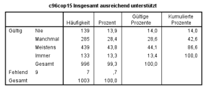
In SPSS, you can create frequencies of variables by using this short script:
FREQUENCIES VARIABLES=c96cop15
  /ORDER=ANALYSIS.
which gives you following overview:
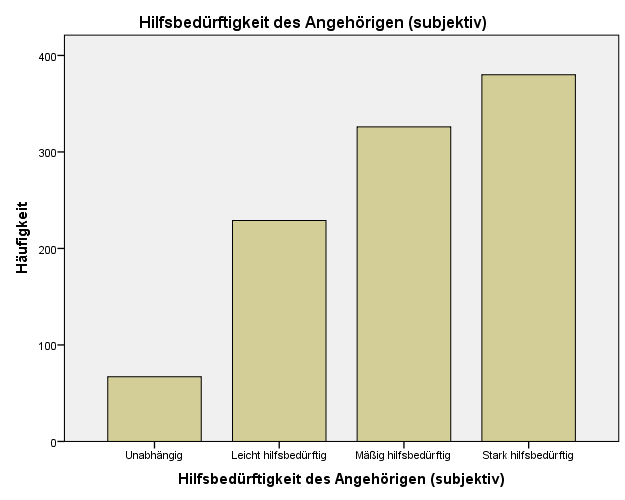
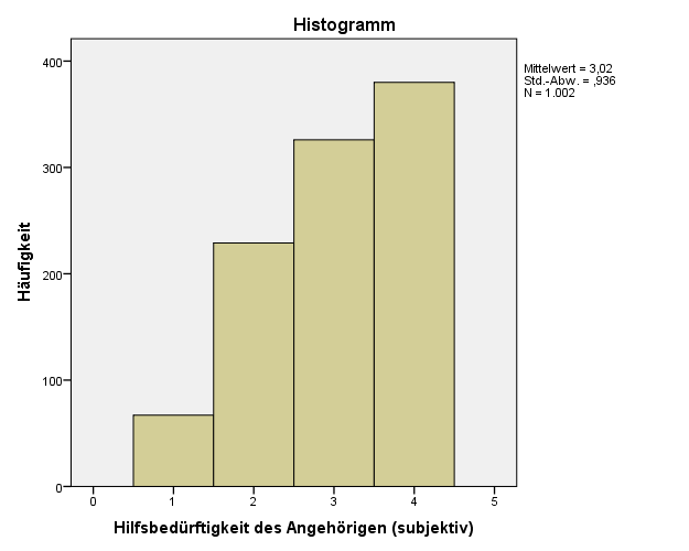
If you add another line to your syntax script, you can plot either bar charts (/BARCHARTS) or histograms (/HIST), too:
FREQUENCIES VARIABLES=c96cop15
  /ORDER=ANALYSIS.
  /BARCHART FREQ
which gives you following results:
It seems to be more effort creating graphs like the ones above in R, but actually it’s almost easier – and you even have more beautiful plots. The only preparation you need is a general function for plotting frequencies in R.
Frequency plots in R using ggplot
Honestly, writing such a function is an effort and takes some time. But once you’ve written it, you can use and reuse it for many situations with (almost) no further adjustments, in case you’ve made it flexible enough to meet your needs.
I will not explain this function in detail because it would take too much space in this posting. Furthermore, I added lots of comments to the script file which should help understanding the code. The R script-file sjPlotFrequencies.R can be downloaded here: script page.
The plotting function is called sjp.frq() and requires at least one parameter (the variable which category frequencies should be plotted). However, you can supply many additional parameters to manipulate the output style of your diagram.
You can change following characteristics via parameters (see header of R-file for more information):
- diagram title
- x-Axis and value Labels
- line wrap postion, when labels and title will break into a new line
- angle of x-axis-labels
- label color
- value label color
- diagram border color
- diagram background (theme)
- automatic calculation of maximum limit of the y-axis
- pre-defined limit of the y-axis
- when to use histogram or bar charts
- bar width
- bar color
- bar transparancy
- bar outline color
- whether value labels should be drawn or not
- whether outline should be drawn or not
- include NA’s or not
- …and more
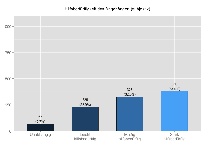
Here are some examples (refer to this posting to see how variables and labels have been imported from a SPSS dataset).
j <- 86 # variable index (column) number
sjp.frq(efc[,j],
        title = efc_vars[j],
        axisLabels.x = efc_label[[j]])
Or you can use the variable name instead of its column number.
sjp.frq(efc[,'e42dep'],
        title = efc_vars['e42dep'],
        axisLabels.x = efc_label[['e42dep']])
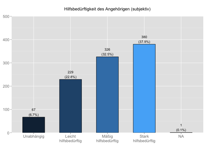
sjp.frq(efc[,j],
        title = efc_vars[j],
        axisLabels.x = efc_label[[j]],
        upperYlim = 500,
        omitNA = FALSE)
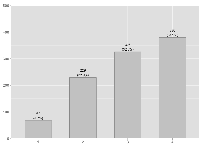
sjp.frq(efc[,j],
        upperYlim = 500,
        axisLabels.x = c("#cccccc"),
        outlineColor= c("#999999"))
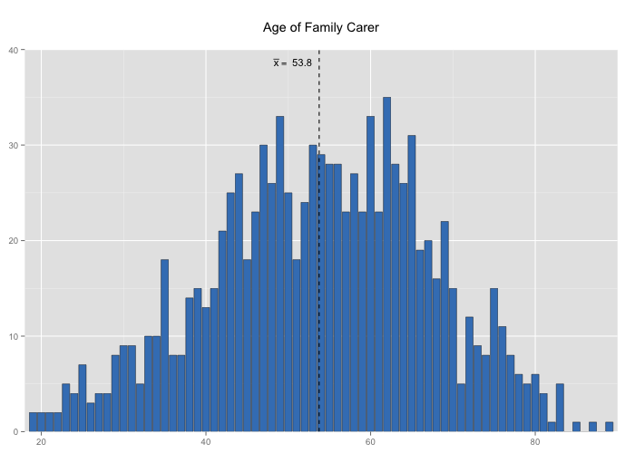
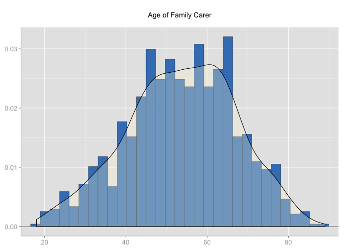
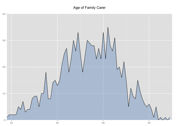
If you want to plot histograms, use the type parameter. You can choose between three different types of histograms: bar charts, density plot with curve or filled area with line.
sjp.frq(efc$c160age,
        title = efc_vars['c160age'],
        type="hist",
        barOutline=TRUE,
        showMeanIntercept=TRUE)
sjp.grp(efc$c160age,
        title = efc_vars['c160age'],
        type="d")
sjp.frq(efc$c160age,
        title = efc_vars['c160age'],
        type="l")
Another great thing is that you can easily plot a set of charts into a PDF file that contains scalable diagrams, i.e. high resolution ready-to-print graphics. The following code will create a PDF file with about 50 diagrams, containing both bar charts (variables with less than 10 categories) and histograms with density curve (variables with 10+ categories).
outputPDFPath <- c("/Users/danielludecke/Desktop/frequencies.pdf")
pdf(file=outputPDFPath)
from <- 291 # start first chart with variable (column) no. 291
to <- 343 # finish with variable (column) no. 343
for (j in from:to) {
  print(sjp.grp(gemo[,j],
          title = gemo_vars[j],
          axisLabels.x=gemo_label[[j]])
  print(to-j) # print progress to console
}
dev.off()
Final remarks
At least on my iMac, I can simply drag and drop single PDF pages containing the diagrams from the Preview app into Word – creating (scientific) graph almost the fastest way, with the help of R and ggplot. 🙂
If you look for more resources on how to improve your workflow, take a look at this posting in TRinker’s R Blog. Futhermore, R-Bloggers is always worth a visit…
Any comments, suggestions and tips on how to optimize my scripts are very welcome!

Hi Daniel,
Nice post.
Could you also share the data, or to make examples on common data available on R packages?
I have tried the freq() function with Hmisc labelled data. I thought it would recognise the label automatically, but it did not.
Do you have any suggestion to be able to use labelled data?
Many thanks
Be sure that axis-labels (category labels) are passed as „vector“-objects:
c(„cat1“, „cat2“, „cat3“, „cat4“, „NA“)
P.S.: My examples are specifically focussing on SPSS datasets where variable and value labels have been imported. You can, of course, simply leave out title and bar labels:
freq(var = data[,’class‘])
or you supply them manually:
freq(var = data[,’class‘], title = c(„my title“), barlabel = c(„cat1“, „cat2“, „cat3“))
Hi Rafik,
the data I used is not public (yet). However, I found a dataset over here: http://calcnet.mth.cmich.edu/org/spss/Prjs_DataSets.htm
These data sets are not labelled nor do have they variable names, so I fixed this in SPSS and added variable names and value labels. You can download the disease-dataset here: http://www.strengejacke.de/R-Stuff/disease.sav
Now you can plot a graph like this:
source(„lib/importSPSS.R“)
data <- importSPSS("C:\\Users\\Luedeke\\Desktop\\disease.sav")
data_vars <- attr(data, "variable.labels")
data_labels <- getValueLabels(data)
source("lib/freq.R")
freq(var = data[,'class'], title = data_vars['class'], barlabel = data_labels[['class']])
Instead of using the column name (class) you can also use its index number as I did in my examples:
freq(var = data[,3], title = data_vars[3], barlabel = data_labels[[3]])
Make sure you use my improved importSPSS-function (see this posting: https://strengejacke.wordpress.com/2013/02/24/simplify-your-r-workflow-with-functions-rstats/)
Best wishes
Daniel
Daniel,
Thank you very much.
Hello, brilliant work!
I have little problem with plotting zero counts and missing values, the script omits the first level (the one with zero count) and gives the value of the last to the count of missing observations. I am not sure if it is a issue with a script or just ggplot2. Thanks!!!
Hello peyo,
I think I got the point and I probably already have a solution to this. I will check this out in detail later and update the script.
The problem is that categories with zero counts simply don’t appear in variables, because R does not automatically considers categories as continouos scale (which is correct). So I have to count the categories either by the amount of supplied cat labels or take the maximum value of categories and insert Zero counts as I did in my script where histograms are plotted. This seems to work, so I will update my script later this day..
Hi Daniel,
Yeah, code worked for me beautifully.
But I have one other question to address.
How can I use a grouping variable as a facet variable when plotting with ggplot?
I have tried to modify your code but with no success.
Could you help with this idea?
Many thanks beforehand.
Hi Rafik,
I’m currently working on a script that exactly does that. I guess in the course of the next week I will post another script here for plotting stacked or dodges grouped bar charts that represent the cross tabulation of two variables (one for the x axis categories and one for the grouping).
I have more plotting script two come, e.g. plotting the results (betas, ORs) of linear or logistisc regression analyses, cluster analysis etc. which are already in an early stage, but not ready for publishing right now.
Best wishes
Daniel
Hi Daniel,
I have just started using your sjPlot functions and they are great! I am specifically using the sjp.frq function to create bar charts. I have text (questionnaire items questions) as the x axis labels and I would like to know if there is a way to justify the text of these labels, as it doesn’t look nice at the moment. Any help would be greatly appreciated.
Thanks a lot
I’m not sure in which way you like to align or justify your labels. As far as I know, the theme-options of ggplot allow following adjustments for axis labels: http://docs.ggplot2.org/0.9.3.1/element_text.html
You can now, if you use my latest package version, return the ggplot-object of a plotting-function with the
returnPlot=TRUEparameter and apply further modifications to the created plot.See following example:
require(sjPlot)require(ggplot2)
# axis labels unadjustet
sjp.frq(efc$e15relat, axisLabels.x=sji.getValueLabels(efc)['e15relat'], breakLabelsAt=10)
# axis labels left aligned
sjp.frq(efc$e15relat, axisLabels.x=sji.getValueLabels(efc)['e15relat'], breakLabelsAt=10, returnPlot=TRUE) + theme(axis.text.x=element_text(hjust=1))
# axis labels right aligned
sjp.frq(efc$e15relat, axisLabels.x=sji.getValueLabels(efc)['e15relat'], breakLabelsAt=10, returnPlot=TRUE) + theme(axis.text.x=element_text(hjust=1))
You can also modify the theme with the ggthemes-package.
require(ggthemes)sjp.frq(efc$e15relat, axisLabels.x=sji.getValueLabels(efc)['e15relat'], breakLabelsAt=10, returnPlot=TRUE) + theme_wsj()
Hope that helps?
Excellent, thanks a lot Daniel! I haven’t been able to make the + theme(axis.text.x=element_text(hjust=1)) but the breakLabelsAt command works fine as it allows me to compact the text. Thank you very much!
Good to hear that it works for you. Yet, have you used the “returnPlot=TRUE” parameter? This allows you to add more ggplot options like “+ theme(axis.text.x=element_text(hjust=1))”.
Hi Daniel,
I am using RStudio and when I add the „returnPlot=TRUE” parameter the plot doesn’t appear (it does appear automatically when that parameter is not there) so I don’t know how to view the plot! Sorry I am not that good with R yet 😛
Strange, I’m using RStudio, too, and it works for me. Please try following:
Great, I managed now. It didn’t work because I was running
gp <- sjp.frq(efc$e15relat, axisLabels.x=sji.getValueLabels(efc)['e15relat'], breakLabelsAt=10, returnPlot=TRUE) + theme(axis.text.x=element_text(hjust=1))
but with your suggested change it works!
One last thing: the hjust parameter aligns text labels to the right or to the left, but it is not possible to justify it, so align both to the left and to the right, to make the labels look neater, right?
I’m not completely familiar with theme-element-options, so I unfortunately cannot help you with that. Probably you should ask that over at stackoverflow.com?
Does this script still exist somewhere? The script page doesn’t seem to exist anymore
It’s now all in the sjPlot-package.
Hi Daniel,
Sorry, my question has nothing to do with this post specifically. However, I couldn’t find any other way of reaching you.
I really appreciate your post about “Plotting Estimates (Fixed Effects) of Regression Models”. However, I had some issue when I applied the function plot_model to my data. I estimated a Cox model with six independent categorical variables, but I would like to plot the model (its estimates and confidence intervals) showing only four from the six independent variables. However, when I select only the terms I wanted, by using the argument `terms`: plot_model(mod, terms=c(„sexo2“, „raca2“, „escol2“, „rendacat2“))
The plot_model didn’t run and the following Error and warning messages came out:
> Error in .axisPars(usr, log = log, nintLog = nint) :
> infinite axis extents [GEPretty(inf,nan,5)]
> In addition: Warning messages:
> 1: In min(new_value, na.rm = T) :
> no non-missing arguments to min; returning Inf
> 2: In min(dat$conf.low) : no non-missing arguments to min; returning Inf
> 3: In min(dat$estimate) : no non-missing arguments to min; returning Inf
> 4: In max(dat$conf.high) : no non-missing arguments to max; returning -Inf
> 5: In max(dat$estimate) : no non-missing arguments to max; returning -Inf
> 6: In .axisPars(usr, log = log, nintLog = nint) : NaNs produced
Would you have a clue of what could be happening? Thank you very much.
Hi, please use the issue-tracker on GitHub: https://github.com/strengejacke/sjPlot/issues/ so feedback like this don’t get lost. If possible, provide a reproducible example.